Thursday, October 31, 2013

Cabbage Roses

I found these beautiful roses online -- and they were made with napa cabbages.  We don't eat napa cabbage, but I've been able to make similar imprints with romaine lettuce.

First, cut off the stem part and fix your salad.  Save the stem/base.  Make sure the cut is as flat as you can make it.   Put ink/paint/mist on your stem and stamp.  You don't want it too wet -- but wet enough for all of it to print.

I used ink with the smaller heads,


but this big one was more than I wanted to ink up.


I thought I had paint in the right color, but didn't.  So I improvised with spray mist.


You can see in the top pic where I cut one out to use.  You could print right to your background paper, but if you're like me, I need to just print when I have them and use them later.  So I just print on white cs and cut and use as needed.

One of my friends who saw one on a layout made the comment that it looks so organic.  It's not perfect, it's much more natural.  I like that.


Around the World

More shots from Vegas -- inspired by the Risk challenge at Child's Play:


Most of the papers are Cara Bella:  Well Traveled (love that line :-) with a little G45 thrown in. Cardstock is Recollections and Coredinations.

testing


Sunday, October 27, 2013

Contest

Or more of a giveaway -- http://luckyflutterbycreations.blogspot.com/2013/10/sunday-funday-and-giveaway.html

...Be Happy

This is another from the Bellagio -- the birds in their garden (where the lighthouse was).  I was inspired by Merry's "title" challenge at S-P to use "Don't Worry....Be Happy" and by Frosted Designs' "Tag You're It" challenge.


They had birds in the aviary and I was taking photos through glass (4 photos in the center) the other two photos show their display and garden.

I used several items that I've won from challenges -- the Twinery twine came from a Let's Scrap challenge, the paper and stickers came from a Fawn Lawn package from CK (about the end of that prize!).  I cut the tag and the title sticker on it is K&Co.  Journaling on the back of it.  I even misted/painted!  The design idea came from something I saw, I think on Pinterest -- a single page layout or sketch with a Z sorta look to it.  Not sure who originated it -- not sure I even pinned it.    But it came back to me as I worked on this  This was such a peaceful place, despite the people who were all around.  Love that the Bellagio saves a place for this in their hotel.

Saturday, October 26, 2013

HB - Surf City

I used a sketch from Let's Scrap :


And a challenge to use all blues and include a stamped image from Love to Scrap!

So here is mine, from our Father's Day trip to Huntington Beach:


The title is a sticker I got in a little shop on the pier.  The pp strips are from K&Co.  The die cuts are from swaps, as is the journaling velum.  I used a mat behind the flipflops and the velum from an old Debbie Mum for JoAnn's Travel stack.  The stamps are sea shells from one of the $1 bins at JoAnn's, I think.  Stickers from a Carta Bella sticker page.  Buttons from an RAK.  Cardstock from DCWV and Coredinations.


Thursday, October 24, 2013

Life's a Journey: Bellagio

I've been trying to use some bits and pieces that I forget I have.  Some of those forgotten items finally made it onto these pages:


I loved this paper for these photos -- from outside and in the lobby of the Bellagio Hotel in Las Vegas.  Absolutely LOVE their glass flower ceiling.  I used a rubon!  (Life's a Journey), I used a mirror!  I used chipboard flourishes, etc. that I've had for 5 years or more -- from 2 different sets!  I triple matted the Bellagio name photo!  I double matted my tag (and the ribbon on it came with the chipboard foil things)!  I'm really trying to go just a little further and not just stick in my comfort zone.  Growth is good.    I'm really happy with how this came out -- I think it was based on a sketch...but I'm not sure where I got it...

Beauty

These are photos from the Japanese Friendship Garden in Balboa Park down in Sandy Eggo (what it sounds like to me).  I was inspired in the creation of this layout by the Barbie challenge at Child's Play -- I used Pink! (not used much here, since my most frequent subject are the guys) and the little umbrella reminds me of all the Barbie furniture and stuff we used to scavenge to play Barbies with.  :-)

I was also inspired by the "Name that Tune" challenge that I'm hosting over at S-P:  the song "Kodachrome" is the inspiration song -- my journaling strips have lyrics "You give us the nice, bright colors, You give us the greens of summer, You make us think all the world's a sunny day, oh yeah, I love to take photographs..."


I used the front and back of the paper -- I loved both.  Absolutely adore the tea set.  I couldn't find a lantern svg, so printed off, colored and fussy cut the clip art.  The title, is of course, the Japanese character and English translation "Beauty".  This was such a lovely, peaceful spot.

Sunday, October 20, 2013

The One Where David Took the Photo of Us in Front of the Lighthouse...

and pretty much cut off the lighthouse.  I love my husband.  Really.  For over 30 years  I have.  Usually I take the pictures.  When I said, "You guys go stand by the lighthouse so I can take your picture," he said, "No, I'll take your picture -- you go stand with the boys."

So I did.

We got the requisite "warm up"photo with them being silly.  Then we got "the real one".

That building behind really is a lighthouse in the Bellagio garden.  It is beautiful there.  This story is on the back, where my DH won't see it.  :-)

I'm submitting this to the Child's Play "Pete's Dragon" challenge.


Friday, October 18, 2013

moments

This layout was based on a CK sketch.  I thought the challenge went til the end of the month, but, ooops, it ended the 13th.  Instead of photos, I used postcards  I picked up at the national park -- I collect them and don't like to glue them down, so usually use photo corners.  I made these myself -- was easier than I thought.
I also chose papers that would fit the color challenge over at S-P:  blue, green and yellow.  The die cut title is one I got in a swap quite a while back.  I love being part of the online scrappy community.

Also included is the "passport stamp" from the Ranger Station.  I didn't buy a passport, but use some scrap papers to get the stamp when we go to a Park.  I love the old poster and stamp postcards.


Wednesday, October 16, 2013

Boothill

These photos aren't really from Boothill, but from El Campo Santos Cemetery in San Diego's Old Town.  It just looks like a Boothill.  I used  a sketch that Carolyn shared at Scrappin-Peeps for a weekly challenge.  My photo of the layout is horrible and has such awful reflection from the overhead light on my table, but if I wait, I may never get it done :-)

Reading about this cemetery, there are reported sightings of ghosts.  One "working girl" who died in the old west days and wasn't allowed to be buried in the cemetery itself -- she's been seen hanging around outside the gate.  When the paved street went in, they paved over several graves.  To appease the spirits who were not happy with it, there were markers and a memorial placed on the grounds commemorating those under the street.  Apparently paranormal activity was so high, that several of the local shopkeepers pooled their money and had an exorcism or similar ceremony performed.  Since then, reports of activity have been down.
I was really surprised when we visited this old graveyard, that some of the graves had recent memorials (the toys and stuffed animals).  Don't know if it's family members still in the area or if it's just that children's graves strike a chord with many of us.

Here's my layout:


Sunday, October 13, 2013

Awesome, awesome, awesome.

My two sons went to Van's Warp Tour in San Diego this last summer.  David and I went down with, we spent a couple nights in a motel, David and I wandered Balboa Park, Old Town, etc. while they were at the concert.  We went to pick them up -- and this is who came out with Scott.  Yes, the Aquabats played.


Here's the sketch I used from 2 Broke Girls:


Mollie's Nipple

This is in Utah, outside Hurricane, where David went to High School.  One of the shots is from up closer to Cedar, the other is down closer to St. George.  I thought it was Molly's Nipple, but found out that the USGS frowns on apostrophes in place names, so officially it's "Mollies Nipple".  But locals (and others) still throw the apostrophe in (probably all those grammar teachers) so it is alternately known as Mollies Nipple, Mollie's Nipple or Molly's Nipple.  I couldn't leave the apostrophe out.

I used a sketch from 2 Broke Girls :


Yes, there's reflection in it, because it's dark out and I'm taking the picture on my kitchen floor with the overhead light on.  LOL

Saturday, October 12, 2013

Three New Layouts from last summer -- Vegas and San Diego

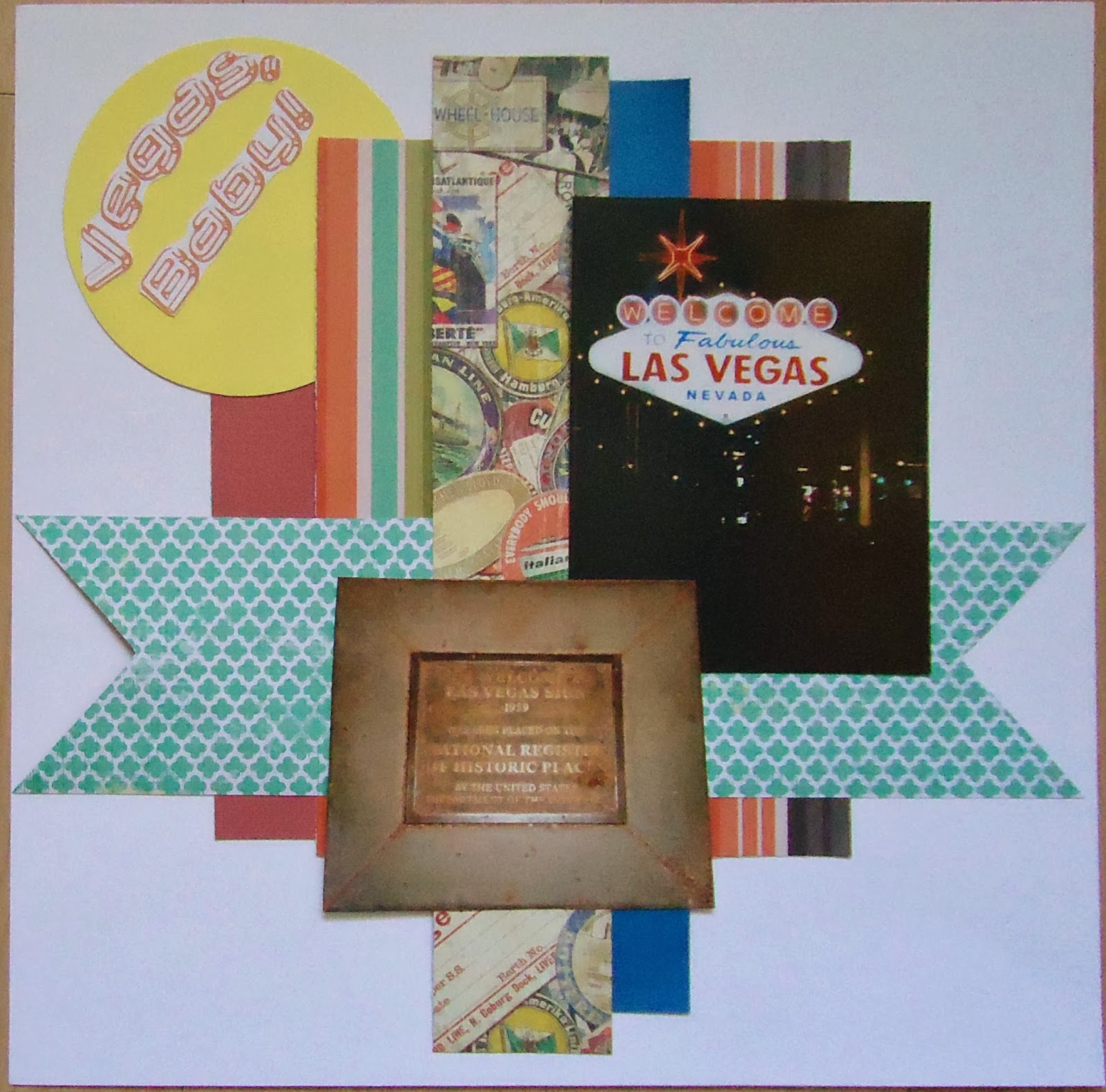
We made a stop in Vegas on our way home.  Here's my layout of the iconic sign.  I'll probably add some handwritten journaling to the bottom right.


This was from a sketch from Paper Secrets:  Their twist is to use dots and stripes.  The stripes are obvious, I'm hoping they'll see the dots in the photo around the Vegas sign or consider the turquoise horizontal piece as blobby dots.  


I loved the sketch -- it looks so Halloweeny, but I like how it came worked for my summer "night lights" photos also.  I put together three pps from 2 manufacturers and 3 stacks  -- the striped is Colorbok, the labels and horizontal piece are K & Co.  Wasn't sure about mixing them (I have such a hard time mixing patterns -- especially the labels and stripes together was hard for me), but I like how it looks all together.  The cs pieces are just scraps. I tried coloring in the lettering on the title to look like neon more -- but it got muddy and you couldn't read it.  There's a lot of white space -- more than I'm used to and it's Really white!  But I think it's effective.   

The next is a 2-page spread about Ben's Dancing in the Luxor lobby.  


We were standing around, trying to decide what to do, and he just started dancing all over the open area.  As I say in my journaling, not the be-bop in place, but the arms and legs flailing, high-energy, all over the place dancing.  We were laughing.  Nobody else seemed to notice -- guess it's Vegas.  Then he threw a shoe and stopped.  I ran across a quote from Nietsche about dancing:  "Those that were seen dancing were thought insane by those who could not hear the music."  Which led me to two more Nietsche quotes:  " We should consider lost any day in which we have not danced at least once." and "You must have chaos within you to give birth to a dancing star."  Beyond the quotes, I was inspired by Devra's challenge at Scrappin-Peeps to use a different palette than we usually use.  I love color -- and tend to use the deeper colors more often.  I started to use pastels on this, but it just wasn't working.  So I went with neutrals -- I use them even less than I use pastels.  Black, white, grey, brown.  The only color in this layout comes from the dancing.  Symbolic, eh?  I thought it was clever LOL.  And -- there was this cool sketch at Bird is the Word with the word -- Dance: 

I used it as inspiration for the left side.

Last, is a layout I did about the guy who stacks rocks down in Seaport Village in San Diego.  It is incredible to see.  Such a fun trip.  I used a sketch from Let's Scrap, but didn't get it done in time for the challenge.  I'm so slow these days.


Thanks for dropping by -- love to see your comments.